Coffee Packaging
2023
Summary:
Branded packaging system designed for production and visual consistency - from a generic craft bag to a bold identity.
Team:
Voyager Craft Coffee
Key Materials:
Paper
Polymers
Brief in Hand, Pens Moving

Bold, Not Aggressive:
. Sketched in the first client meeting - faster to react to a drawn idea than a written brief.
. Client wanted adventure without edge - the arts and crafts movement gave us the visual language: layered, illustrative, regional.
Color Owns the Shelf
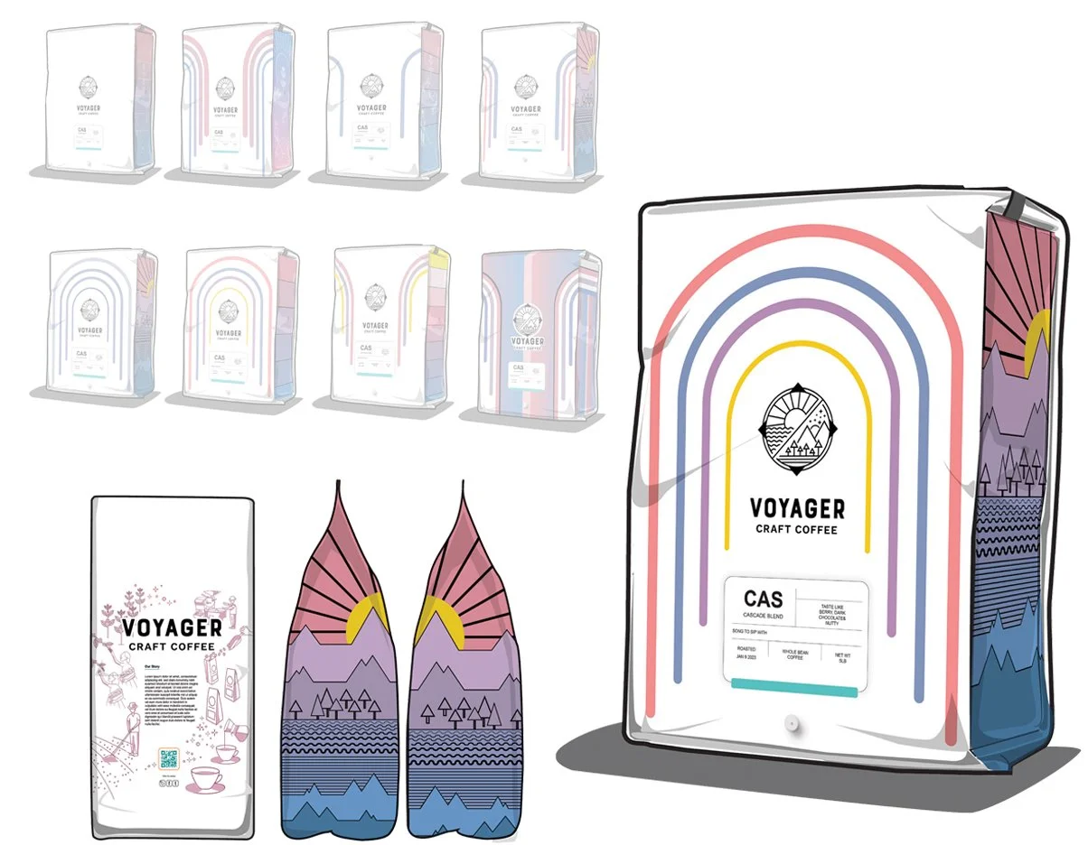
Color As Identity:
. Illustrated elements and typography structured around the bag’s panel geometry - hierarchy designed for a shelf, not a screen..
. Composed layout systems to establish hierarchy with vibrant colors, much of their style.
. Integrated graphic decisions with print and production constraints.
Interior Elements
into Design Direction
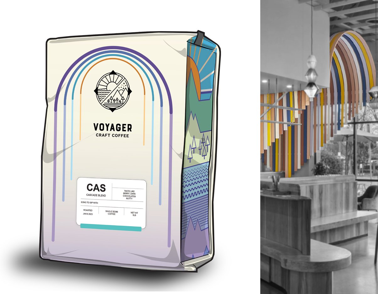
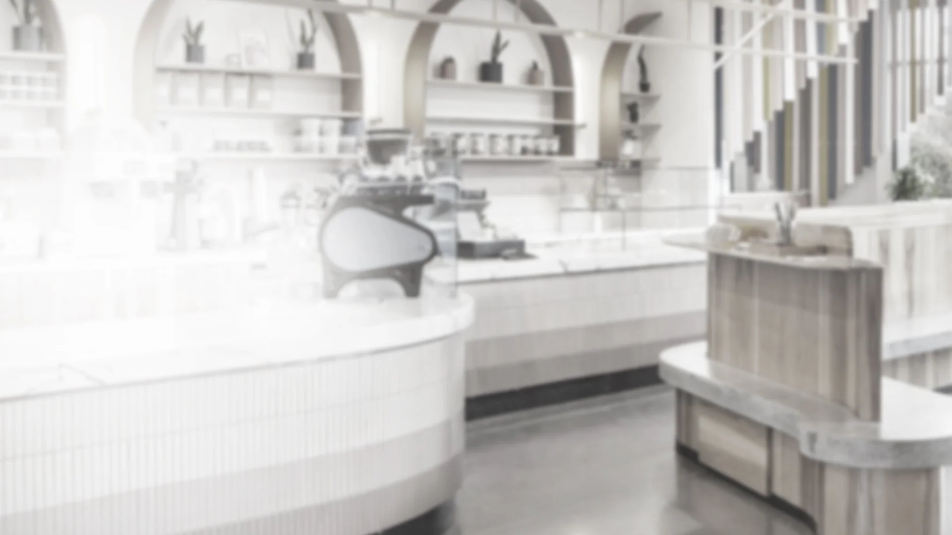
Pulled From the Room:
. Walked the space before the design — pulled color, texture, and spatial references directly from the environment the bag would live in.
. Aligned the visual language with the physical cafe so the packaging felt native to the space, not imported.
Scaling for Production
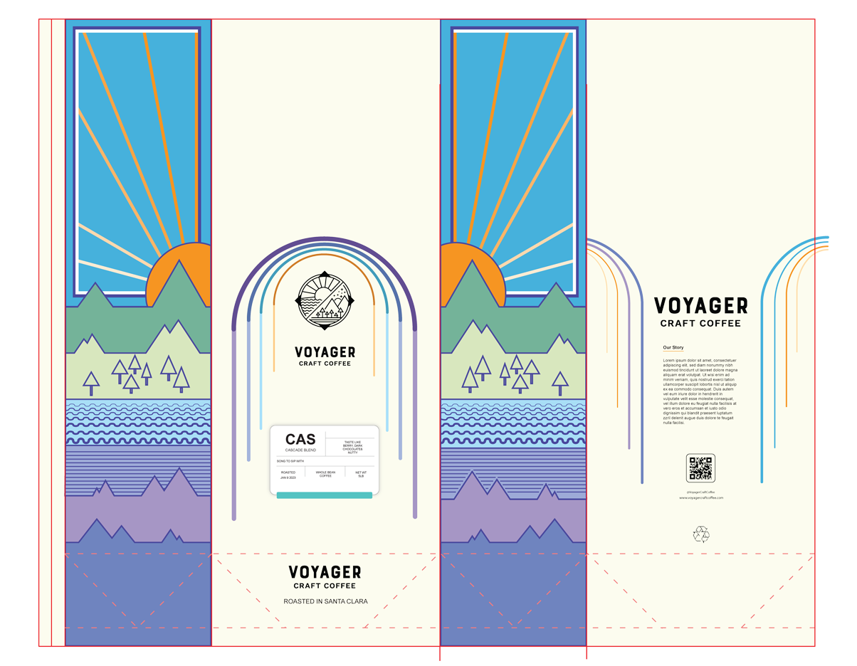
1,000 Units. One Identity:
. Transformed a commodity kraft format into a branded system with a distinct visual identity.
. Delivered production-ready files supporting a 1,000+ unit run across retail and cafe environments.
Generic to Bold
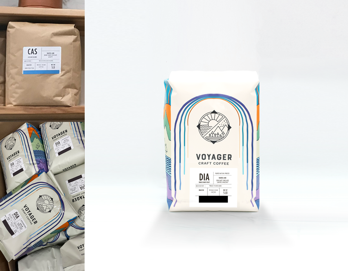
1,000 Units. One Identity:
. Transformed a commodity craft format into a branded system with a distinct visual identity.
. Delivered production-ready files supporting a 1,000+ unit run across retail and cafe environments.